Get started on your Space Studies Degree at American Military University. |
By Wes O’Donnell
Managing Editor of In Military, InCyberDefense and In Space News.
It could be called “A Tale of Two Logos”: From 1975 to 1992, NASA’s primary branding was the sleek and stylish “worm,” so named because of the connectedness of the lettering.
NASA’s original logo, known colloquially as “the meatball” was introduced a year after the agency was established in 1959, and is filled with references to space and flight, such as a planet, stars and an orbital path.
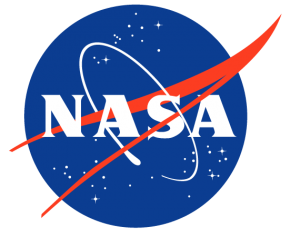
Clearly, the meatball logo is much more representative of the space agency’s mission, but there is just something about the minimalistic worm logo that appeals to Generation X; perhaps because it is the logo NASA used during our formative years.
President Nixon Was an Advocate for the Worm Logo
Introduced in 1975 as part of a nationwide overhaul of federal agency graphics, the Nixon administration hired two young designers from a New York firm, Bruce Blackburn and Richard Danne, who set out to create something “very simple, very direct; otherworldly, unexpected, something that you would remember, for sure.”
In a recent phone interview with CNN, NASA’s chief historian claimed that “one of the reasons why the Nixon administration wanted to change NASA’s logo was that they wanted to change NASA’s mission itself, to make it a generalized problem-solving agency and contribute more to the economy — which would mean less space exploration. The worm was intentionally designed without any stars or any aircraft in it, but just letters, because NASA could then be anything you wanted it to be, including not a space agency.”
Because the worm logo had very little input from NASA employees at the time, (many had no idea that a logo change was even in the works), they were surprised when new letterhead arrived from headquarters with no further explanation.
The Worm Logo Gets the Axe
Then, in 1992, newly appointed NASA administrator Daniel Goldin retired the worm logo nearly overnight. According to Barry, his disdain was so notorious that staff at NASA centers would go on “worm purges” in preparation for his visits.
Now, after 28 years, the worm logo is set to make its return. NASA Administrator Jim Bridenstine revealed that it has been painted on the SpaceX Falcon 9 rocket that’s due to launch to the International Space Station as soon as next month.
NASA has brought back its sleek iconic logo, lovingly named the worm for its curvy red font, in time for its first crewed spaceflight using American rockets in almost a decade. Jim Bridenstine, the US space agency’s administrator, announced the resurre… https://t.co/GuPWUssnkA
— The Register: Summary (@_TheRegister) April 3, 2020
While the SpaceX Falcon 9 launch will signal the logo’s return to public prominence, the worm never really went away: it lives on in the memories of countless GenXers. It is also carved in granite at the NASA headquarters building in Washington D.C., which made it difficult to purge during the Goldin era.
Fortunately, minimalistic design buffs, fans of sci-fi and GenXers alike can celebrate the triumphant return of the worm, at least temporarily.
After all, there’s nothing futuristic about the Times New Romanesque-font of the official NASA logo still in use today. Perhaps the worm logo’s resurrection, albeit for only one mission, will prompt a cry for its permanent return; far stranger things have happened in 2020.
This is one GenXer that wants to see more “worm” on his taxpayer-funded spaceships.
Comments are closed.